
I have used graphs generated in Python many times for displaying data in presentations and reports for work.
The first thing you need to do is to install pylab. This is a library which adds the graph functionality to python.
To do this either log directly into your Raspberry Pi and load LXTerminal from the desktop, or SSH into your Raspberry Pi, if you want to connect remotely. Type the following into the command line and press return.
sudo apt-get install python-numpy python-scipy python-matplotlib
This program is written for Python 2.7. To load Python 2.7 click on the IDLE icon on your Raspberry Pi desktop and not the IDLE 3 icon.

This will open the following window.

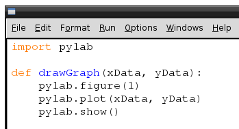
Click on File and then New Window and an empty text box should open. This is what you will type your program into.

The first line we will type is
import pylab

This imports the pylab libraries that we have just installed.
I will next write a function to draw the graph for me. You obviously don't have to write this as a function, but if you want to use this several times in a program, it makes good sense. Besides it's a great opportunity to practice writing a function!
The function is only 4 lines long, so I will show you the whole function first and explain each line afterwards. Remember the 2nd,3rd & 4th line are indented, so these should have a tab (4 spaces) before the text.
def drawGraph(xData, yData):
pylab.figure(1)
pylab.plot(xData, yData)
pylab.show()
- The first line creates the function, names it and tells the function what inputs it expects. In this case xData and yData.
- The second line creates the graph window. If you omit this line then it defaults to figure(1). However its good practice for later to keep this in and not rely on the default.
- The third line is telling the graph what data to plot. xData for the x axis and yData for the y axis.
- The fourth line asks pylab to show the graph you have created.
Your program should look like.
Right that's the difficult bit done.
Now lets create some data to put into our graph. The data below is for the average weight of boys over their first 2 years since birth. Each set of data should only be on one line. If in doubt cut and paste the text into your program.
ageBoys = [0, 1, 2, 3, 4, 5, 6, 7, 8, 9, 10, 11, 12, 13, 14, 15, 16, 17, 18, 19, 20, 21, 22, 23, 24]
weightBoys = [7.16, 9.15, 10.91, 12.56, 14, 15.43, 16.53, 17.64, 18.74, 19.62, 20.28, 21.05, 22, 22.27, 22.82, 23.26, 23.7, 24.14, 24.58, 25.02, 25.35, 25.79, 26.12, 26.57, 28.4]
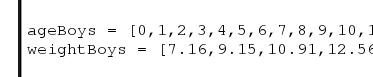
Note the graphic above only shows some of the data. Refer to the text for the complete set of data.
Finally lets call the function we created with the data we have just typed in
drawGraph (ageBoys, weightBoys)

Because our function is expecting xData first and then yData it will use ageBoys as xData and weightBoys as yData.
Pressing the F5 key will now save and run your program. When asked for a filename type in basicGraph.py
Do you see the following graph?

Perfect! Or is it? Now your graph looks good, but it is totally meaningless. You may know what the data represents but the people looking at your graph will not. Lets add in some labels.
So just above the two lines which have the age and weight data type the following.
pylab.title('Age vs. weight for an average boy')
pylab.xlabel('Age (Months)')
pylab.ylabel('Weight (lb)')
These are fairly self explanatory. They set the title, xlabel and ylabel in that order.

Press F5, do you see the difference?

I hope this has given you an introduction to basic graphs in Python, we will look at more complex graphs at a later date.
No comments:
Post a Comment