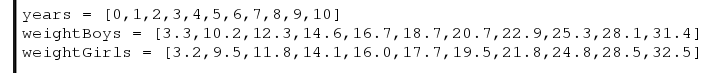
Let us use the following data for the average weight (Kg) of boys and girls over their first 10 years.
years = [0,1,2,3,4,5,6,7,8,9,10]
weightBoys = [3.3,10.2,12.3,14.6,16.7,18.7,20.7,22.9,25.3,28.1,31.4]
weightGirls = [3.2,9.5,11.8,14.1,16.0,17.7,19.5,21.8,24.8,28.5,32.5]
It turns out that adding a second line to the graph is very simple.
Lets start with the code we wrote for the basic graph and look how we need to modify it to take several sets of data.
We want to recycle as much code as possible, as this is the most efficient way to program.
Previously we started with import pylab. We still need to import the pylab libraries, so lets keep that line as it is.
We then created a function called drawGraph(xData, yData). As this function takes x and y data and draws a graph from it, lets keep that the same for now.

For this excersise we have said we want to plot the age vs. weight for boys and girls over the first 10 years.
Looking at the previous labels we need to modify all three labels.
- The title needs to be modified, as we are not just looking at boys weights.
- The x label needs to be modified, as we are now looking at the first 10 years and not the first 24 months.
- The y label needs to be modified as we will be using Kilograms (Kg) and not Pounds (lb) as our unit of weight.

Now we need to input our data.
As we are looking at boys and girls over the first 10 years both boys and girls can use the same data in the x axis.
There is a list of weights for boys over the first 10 years, and a second list for girls over the same period.
The function drawGraph (xData, yData) expects the x data and the y data. So for boys we would have to say
drawGraph(years, weightBoys)
and for girls
drawGraph(years, weightGirls)

So lets now run that.
Now pressing F5 to save and run the program, what happens?
There only seems to be one piece of data in the graph.
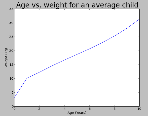
Shut down the first graph, ah a second graph appears, its appeared once the first graph was shut down. Why was that?

Well look at the code in the function. We have pylab.show() as the last statement in the function. That statement is saying show the graph. However at this point the function has not seen the second piece of data.
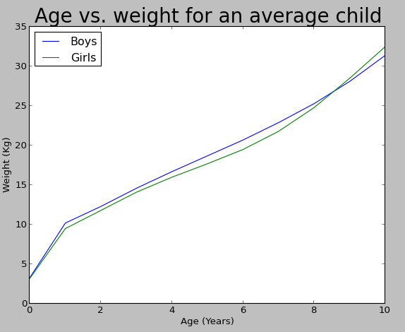
So lets move the pylab.show() statement out of the function, and place it after the two drawGraph statements.

Pressing F5 should now save the graph and then redraw it.

Does that look a little more like what you were expecting?
The only problem is we cannot tell what the blue line represents and what the green line represents. Lets add in a legend to distinguish them.
Just before pylab.show() add
pylab.legend(["Boys","Girls"],loc="Upper Left")
This adds the Legend with Boys and Girls in the upper left hand corner. Your code should now look like this.

Now press F5 again to see your final plot.
Hopefully you are now confident plotting multiple sets of data onto a single graph.
Also remember that when programming things will not always go right first time. But think about what you are asking your program to do and it should point you to the fault.
You have remarked very interesting details ! Also visit my site: 메이저사이트
ReplyDeleteI went over this internet site and I think you have a lot of great info , saved to favorites. 경마사이트
ReplyDeleteI have been reading out many of your articles and it’s clever stuff. I will make sure to bookmark your blog. 사설토토
ReplyDelete